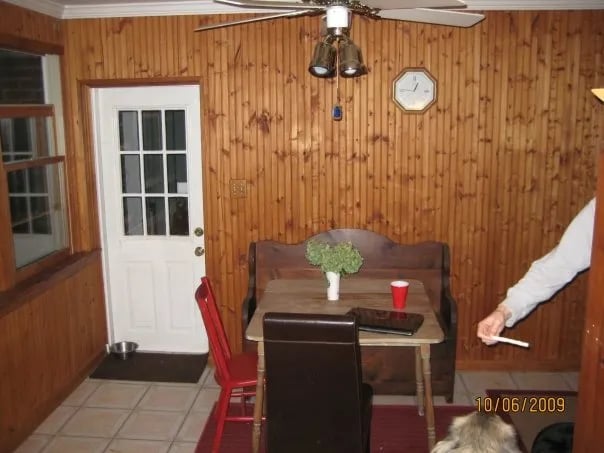
Our little Dutch Colonial has gone through lots of renovations since we bought it in 2009. Today I’m going to give you a look inside the evolution of our eat in kitchen area. This little area was originally a breezeway that the owners before us enclosed. The best part about this room is all of the natural light and the access to right out onto the deck which we adore (and will miss horribly if we move). Here is what the room looked liked when we bought the house.
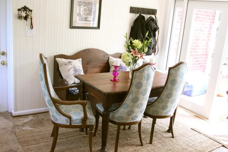
Then, after a gut job, it evolved into this….which I did love…but then the chairs were sold, and we have a few other evolutions of the space.
Then, when I decided to suck it up and have the house painted after we found out we were having twins and might start looking to move the space evolved a bit. I started playing with a color pallet for the house. I wanted something that would work for us if we stayed in the house but also be fresh and inviting if we put it on the market.
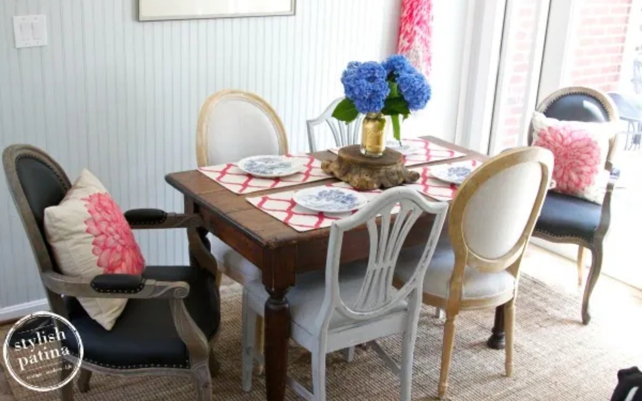
I decided to go with Wickham Gray for our eat in kitchen. I don’t really consider it a gray to me it has more blue/green in it. For a room that has tons of light it was perfect! So now say hello to our refreshed eat-in kitchen.
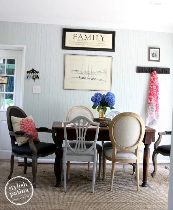


You will notice some elements of the room haven't changed; here is a breakdown...
– I love my jute rug from IKEA, a steal at $99; durable, it hides dirt, and is soft 🙂
– The fabulous farm table I scored at an estate sale about 7 years ago for $100 (it’s one of my all-time favorite scores).
– The curtains are IKEA, a pair for $35. I have played with these in all different ways; you can add ribbon to the edges to dress them or tie them up with burlap. In general, they are a great, inexpensive curtain for a casual setting.
– The head chairs are reproductions from the shop, but I don’t care they are fabulous and you can wipe them down!
– The other 4 chairs – 2 are painted with Paris Grey Chalk Paint and accented with King's Cold gilding wax and the other two are reproduction French balloon backs from the shop.
– The blue & white china is vintage from the shop — LOVE!!!
– Placemats are from Home Goods:-) Score for like $5!
– Pillows are Target 🙂 Pink isn’t usually my color BUT I love these pillows so I just went with the pink, a little nod to Sarah my manager at the shop. She is soo happy I have opened myself up to the color pink a little more.
– The ball jar I am using as a vase is vintage, and then I put some gold leaf on it for fun, the tutorial is here. Flowers straight from the garden!
If you are looking for other wall color ideas and design tips, I have an entire Pinterest Board dedicated to wall colors.
Upcoming Events
Rough Luxe Market – Monthly warehouse sale, July 18-20th – Theme is cottage chic.